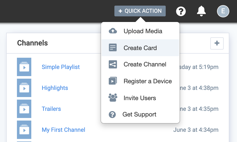
Create a card
Click on Create Card from the Quick Action menu to begin.
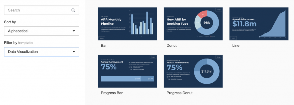
Select a Data Visualization card template
To specifically view only Data Visualization card templates, select Data Visualization from the Filter by template dropdown at the left.
You can choose any of the available data visualization card types:
- Bar
- Line
- Donut
- Progress Bar
- Progress Donut
Proceed to enter data
Once you have selected the type of data visualization that you want, you can start entering the data you want to present. You can review all of the types below, or you can skip to the specific one you need:
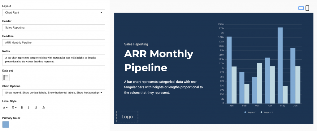
Describe your chart with key text blocks
Enter in the Header, Headline, and Notes. The text editor can be used to customize the text styles.
The position of the Notes can be customized with the following options:
- Top
- Middle
- Bottom
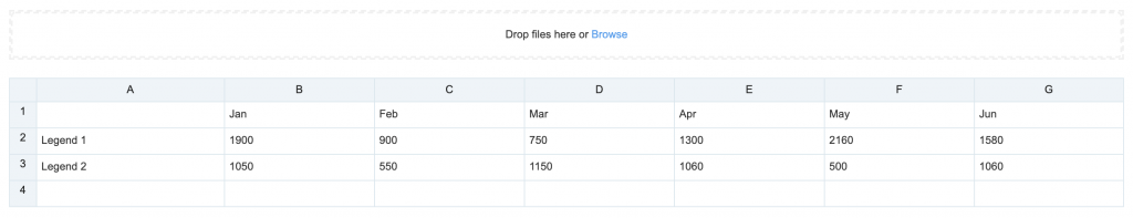
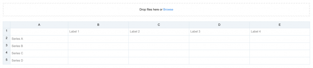
Enter data manually or import data
Click the Import Data button, and populate the table using one of the following methods:
- Enter the data manually.
- Copy and paste data from an external table.
- Import data from an Excel spreadsheet (.xlsx).
Data populated in the first column represents the data series, and the second column onwards represents the value.
Customize the chart's look and feel
You can further customize the look and feel of the chart with different layout options, chart options, label styles, background and colors, and a logo.
Chart options include:
- Show as horizontal bar
- Show legend
- Show axis lines
- Show vertical labels
- Show horizontal labels
- Show vertical gridlines
- Show horizontal gridlines
- Enable animation
- Use custom color palette – Allows you to select the color of each slice of the chart.
Describe your chart with key text blocks
Enter in the Header, Headline, Key Result, and Notes. The Text Editor can be used to customize the text styles.
The Headline and Summary positions can be customized with the following options:
- Top
- Middle
- Bottom
- 50-50 Middle
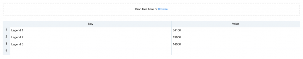
Enter data manually or import data
Click the Import Data button, and populate the table using one of the following methods:
- Enter the data manually.
- Copy and paste data from an external table.
- Import data from an Excel spreadsheet (.xlsx).
Data populated in rows represent the X Axis, and data populated in columns represent the Y Axis.
Customize the chart's look and feel
You can further customize the look and feel of the chart with different layout options, chart options, label styles, background and colors, and a logo.
Chart options include:
- Show as line
- Show axis line
- Show point
- Show point labels
- Show vertical labels
- Show horizontal labels
- Show vertical gridlines
- Show horizontal gridlines
- Enable animation
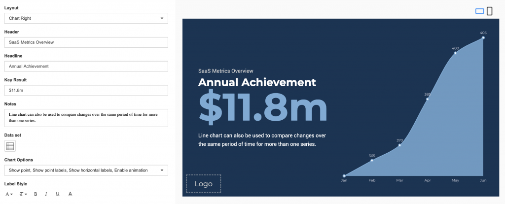
Describe your chart with key text blocks
Enter in the Header, Headline, and Notes. The Text Editor can be used to customize the text styles.
The Notes position can be customized with the following options:
- Top
- Middle
- Bottom
Enter data manually or import data
- Enter the data manually.
- Copy and paste data from an external table.
- Import data from an Excel spreadsheet (.xlsx).
Customize the chart's look and feel
You can further customize the look and feel of the chart with different layout options, chart options, label styles, background and colors, and a logo.
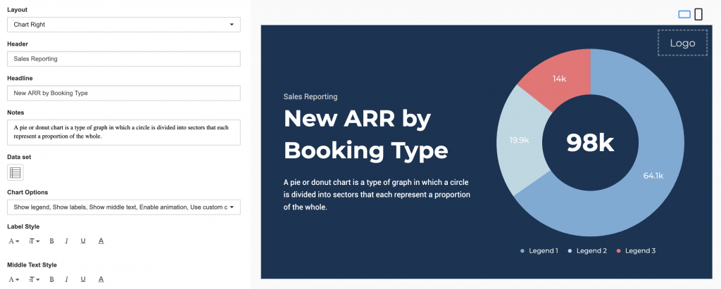
Chart options include:
- Show as pie
- Show legend
- Show labels
- Show labels as percentage
- Show middle text
- Enable animation
- Use custom color palette – Allows you to select the color of each slice of the chart.
Describe your chart with key text blocks
Enter in the Header, Headline, Key Result, and Notes. The text editor can be used to customize the text styles.
The Headline and Summary positions can be customized with the following options:
- Top
- Middle
- Bottom
- 50-50 Middle
Enter the Key Result values
The Key Result can be customized to display the following, by entering the respective codes below:
- Percentage = {model.progress.percent}
- Remaining = {model.progress.remaining}
- Goal = {model.progress.goal}
- Current = {model.progress.current
Enter data for the progress bar
Proceed to enter in the data for the progress bar:
- Goal Label – Enter in the label or title of the target goal.
- Current Label – Enter in the label or title of the current goal.
- Remaining Label – Enter in the label or title of the remaining goal.
- Current – Enter in the monetary, time, or percentage value of the current goal.
- Goal – Enter in the monetary, time, or percentage value of the target goal.
Customize the chart's look and feel
You can further customize the look and feel of the chart with different layout options, chart options, background and colors, and a logo.
Chart options include:
- Show percentage
- Show current
- Show goal
- Show animation
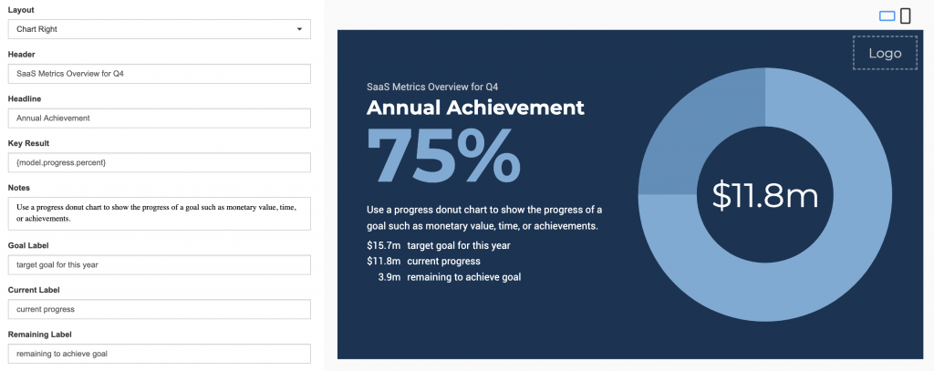
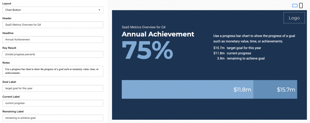
Was this article helpful?